Let’s admit it. We all love a little praise. Maybe it’s praise for some great feat we’ve accomplished or some goal we’ve met, or for something we’ve created. Something we’ve poured our own blood, sweat, and tears into. And this is never more evident than with our babies. You know, those we’ve worked really hard on. Those things that represent us to the world. A portrait we’ve painted, a novel we’ve written, or a website we’ve designed. Attack any of these, and you’ve assailed my very soul. And most of the time, we go unscathed. Our friends and family assure us how very special we are. That the world is a better place simply because we grace it with our presence, and that everything we produce is magical, sugary goodness.
 But if you’re fortunate, you’ve got at least one person. You know that person. That one person who will tell you the hard truth. Those people who will hold your special baby in their arms, look deeply into its glassy little eyes with a tender smile and say “My my, what an ugly child!” For me it was one of my professors in the NCSU College of Design. A lovable, Korean sadist affectionately known as “Bong”. I swear I could almost see a little sparkle in his eyes as he took a big, red sharpie and tore a bloody gash of ink across my once beautiful sketches. Then, he would turn to me and reply in stilted english.
“This is ugly. It’s not pretty. Very, very ugly.”
Like my good friend Tyrion, of the House of Lannister says “Most men would rather deny a hard truth than to face it…”
It can be hard to accept that something that feels so personal as our websites homepage has flaws. After all, this is the digital face that we’ve chosen to present to the world wide web. But if we can step back, and look objectively we can re-establish our website’s goals and reassess our homepage’s design and performance in light of those goals. These truths aren’t easy to face but the sooner we can face it, the sooner we can correct it, and get on the road to generating more leads from your real estate website!
So, allow me to be your Professor Bong, as it relates to two hard truths about your website. I promise that I won’t be gentle with your baby.
1) Nobody Cares About You (at least not yet)
Most of us like to think of our websites as our digital living rooms. We invite you to come in and stay a while. Take a look at our family photos, enjoy our décor and even play with our little pets. To sit down and have dinner with us, while we regale you with all of our accolades, travels and accomplishments.
The truth is your website is more like a tiny, tiny little food stand in the middle of your local mall’s food court. That is if the food court boasted over 1 million eateries. What’s more, is that even when narrowed down to a specific cuisine (or in this case real estate market), there are still hundreds if not thousands of other options.
After you’ve done all the investment to actually drive traffic to your site, you’ve got seconds to convince them to stay before they’re off to the next offer. Do you really want to spend that time focusing on your face, or on your dog, or any of the other thing about you, that does not relate to why they came to your site in the first place. Spend less of your digital real estate focusing on pictures of yourself or articles about your awards or even your personal life. Those things are better placed on your “about us” pages and maybe a little on your blog, and at LinkedIn.
2) Less Is More. (Search. Search. Search.)
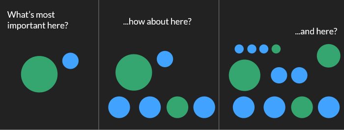 The old adage “If everything is important, nothing really is” rings especially true for web design. I get it, you have so many things that you absolutely have to showcase, and that absolutely have to be show cased on on the home page. And those things above the fold, and the list goes on and on.
Before long, you’re home page is cluttered with scores of links, graphics, calls to action and images and almost zero engagement. Our culture is all about speed and when given too many options and too little direction, most visitors would much rather opt out than to spend the time fishing through fifty click-points to find the one relevant too them. After all, there are at least four or five other links they’ve already got open in there browser’s tabs and yours is now just one less that they have to look through.
You need to drive the conversation. You need to give the visitor what they want and give it to them immediately. For real estate sites, that means one thing.
Search – Search – Search!
75% of your homepage’s focus should be on allowing visitors to search listings. You’d be much better served to have a beautiful, eye-catching image, combined with an intuitive MLS property search form like DaknoIDX or IDX Broker.
Test and Evaluate Your Design!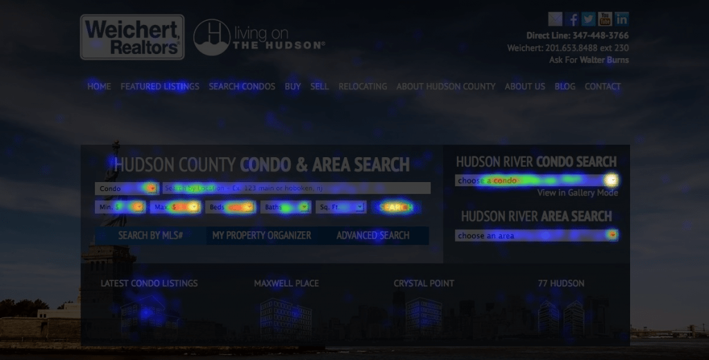

If you already have a website you can test it out for yourself and you’ll see what I mean. Sign up for Crazy Egg or Lucky Orange. These free/low cost tools are easy to use, and will allow you to start tracking the activity on your page. After about a month, you’ll see that the engagement near your search features will be white-hot, while the photos of your last ski trip will be stone-cold.
Stay tuned as the Dakno design team offers more great design tips for your real estate website!
Ryan