You need something. Of course you do, otherwise, you wouldn’t be headed to that website. You had very high hopes that what would pop up on your screen when you hit “Enter” would be a visually-appealing site that helps you find your product or service fast. Seconds later your corneas are burning. What in the world is this you’re looking at?
It’s unfortunately happened to the best of us. You pull up a website anxious to find what you need and you’re immediately bombarded with terrifically bad colors and you really just can’t take it anymore. The hues are harsh and the text is difficult to make out against the background. So, you leave as quickly as you came. Another dissatisfied site visitor who could have become a prospect.
Don’t let this be your site visitor. Having already developed your brand and chosen how you want to be portrayed, one of the key factors that you’ll now need to decide on are your brand colors. The questions to ask yourself are, “what would these colors portray me as to my clients?” and “how would my site really be seen?”.
Why Color is One of Your Website’s MVP’s
First, let’s take a moment to discuss what colors (also know as “hues”) really are:
“The property possessed by an object of producing different sensations on the eye as a result of the way the object reflects or emits light.”
In Layman’s Terms (because we all like Layman’s Terms), it’s how you view light reflected from an object. Simple enough. You see something and the way your eye reads the light coming off of it, is a color. Now on to the good stuff, such as why you caring about color will win you business.
Colors can direct a person’s mood and change how things are perceived. They’ve even been used as a source of therapy to remedy different ailments (Chromotherapy) so that alone shows their power. The colors you choose and how you choose to use them will either agree with most viewers and possibly land you a new client OR send them running to find another Realtor.
Your Site Should Dress to Impress
First impressions ARE everything. In today’s fast-paced technological era, we all have a ton of information that we’re bombarded with every day. This includes your competitors’. Don’t be disposable. Show your site visitors that you are essentially THE EXPERT as soon as they are directed to your site. The first step is having a site that drives emotion and the right colors go a long way in helping to do that.
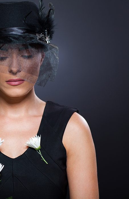 The right hues can evoke a feeling of luxury on a site while the wrong ones can have an opposite effect. For example we all love the color black, but, have you ever thought about what using too much of it can portray on your website? Yes, it symbolizes both strength and power. The problem is too much of it also symbolizes death or grief and those emotions don’t sell homes.
You’ll want to start off with 3 graphic colors. Any more than 3 colors will often make the design look too busy. By using only three, you’ll create variation as well as visual interest. Please note if there is not enough contrast between the colors, it can become very straining to the eyes. Remember that the first impression should make people want a second one.
[Interested in learning more about color? See Color Meanings]
Professionalism and Readability
When choosing colors for your website, you must always go with colors associated with your brand. Not doing this can make your identity hazy as it breaks continuity. Let’s not confuse anyone! Choose hues that you like, as this is now a part of you. You will forever bleed blue and gray if this is the path you have chosen.
Below are a couple of lovely examples of colors done right. Because of the color schemes chosen, your eyes literally dance across the page. Contrast has been made identifying text hierarchy throughout. A dominant color is paired with a neutral one allowing for easy readability.

Now, take a look at some examples of unfortunate color choices. As you can see, multiple colors have been chosen for both and it’s worth noting that a bright yellow background does not read well for anyone! They have not provided contrast for the body text, either. This leaves all copywriting difficult to read and appears very unorganized. See for yourself.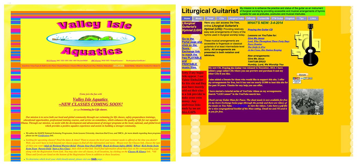
Lastly, professionalism does not mean you have to stick with boring drab colors. Colors can be rich and soulful. The right combination of hues can be very powerful and either work for the good or your business or grossly to the detriment. Unless you own a childcare center you’ll probably not want to pair pastel colors, as an example.
Accent Your Colors!
If you have chosen a bold exciting color for your brand, I applaud you! People tend to be afraid of color and decide to drive the “play it safe” route. Bright colors are great for getting noticed, but, let’s make sure you are getting noticed for the right reasons. Below, the brand color is a lively apple green. Instead of choosing green for the site’s background color, we used it as striking accents throughout to really grab your attention.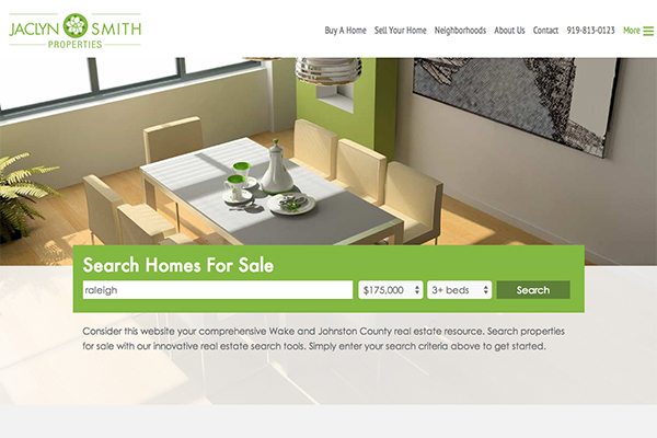 If the background was bright green instead of the relaxing grays, you would feel immediately overwhelmed. This leads to “eye fatigue” and clients looking elsewhere. Pair your exciting brand color with a neutral so that your site is well balanced and pleasing to the eye.
Set the Mood
When it comes to home buying or selling, the process is always intimate and very personal. Whether you are a Realtor specializing in homes or condos on an airy coast, cozy mountains, or bustling city, use this to your advantage! As shown on the site below, calming beach blues and greens have been blended with sandy tans.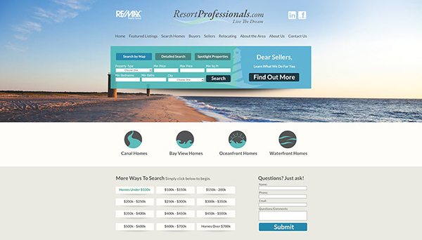
Aware or not, these elements together have drawn you in. You immediately feel as if you’re at the beach feeling the elements. The “mood” has been set and you are now promoting a desired lifestyle. When it comes to color, it is all about how you use it. Remember that when designing your site, it’s not simply about the text content included. You need to really present yourself well with a great and unique design.
Life is in color so let’s enjoy it!
Ashley
Ashley, I have always held the highest respect for Danko Marketing. I’m looking for a design for my business card. Can you give me some guidelines on what is your minimum pricing?
I’m on one man band who lost all of his wind in the economic crash but I still have the desire and will for greatness.
Hi Don, we can certainly help you with this! We offer hourly work for Corporate Identity that can include letterheads, thank you cards, business cards, and more. When designing this for you, we will use the style of your site, colors, and logos. Feel free to contact us and we will be glad to provide more information once we have discussed further your design needs. We look forward to hearing from you!