All Dakno clients now have the option to enable (or disable) a mobile version of their website. To enable this option, log into your Admin panel and go to Settings. Scroll down to “Mobile” and you’ll be able to select “on” or “off”.
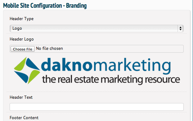
Once you’ve turned on your mobile site, you will need to set it up. To do this go to your current Design (“Design” > “Current Design” on the menu). You will have a new section towards the bottom of your design settings called “Mobile Site Configuration”. Here you can adjust your logo or header text, add footer content, select your main colors, and a few other customization options.
The mobile site is effectively a new design, so your feature graphics, rotating header images, etc. will not be available. Content is key for your mobile site.
If you have content on a page, for example, an area with lots of images that may not need to be available on mobile or want to replace those images with something else on mobile, you can use shortcodes to do this:
[desktop-only]Content that is only viewable on desktop computers or laptops[/desktop-only]
[mobile-only]Content that is only viewable on mobile devices[/mobile-only]
Content that does not have a shortcode surrounding it will be visible on all devices. These shortcodes should be used only as needed. These shortcodes will be available within your WYSIWYG editor.


