We know what you’re thinking and, yes, we have had work done…well, to Dakno Admin at least. Our team’s been hard at work analyzing color schemes, fine-tuning layouts, and perfecting icons to make sure that our latest update is sleek, accessible, and simplified.
But don’t worry—it’s still the Dakno Admin you know and love! We may have repainted the room, but we left the furniture in the same place, so to speak.
Here’s a quick summary of the changes you can expect from our new look—and how even the smallest modifications can make your life easier!
It’s All About Accessibility
We’re not saying Dakno Admin wasn’t already easy to use, but the tweaks we’ve made have significantly increased both the accessibility and readability of the site. Take a look at these before and afters to see them in action!
Dakno Admin Site Navigation
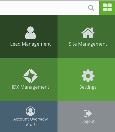
Before
After
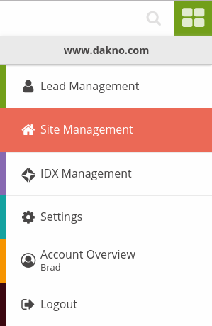
Out with the varying shades of green, in with the dynamic color scheme. The new navigation is easier to read, easier to look at, and covers much less space, thanks to the dark grey text, multi-colored bars, and sleek dropdown format.
Lead Statuses
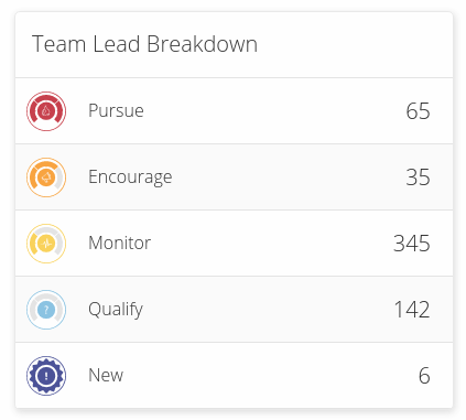
Before
After
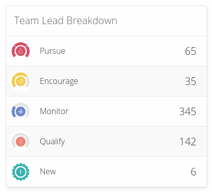
Can’t quite put your finger on what’s different here? It’s subtle, but we’ve sharpened the lead status icons by removing the outlines and slightly altering the colors to better correspond with the statuses—red for a hot lead (pursue), yellow for a potential lead (encourage), and blue for a cold lead (monitor). We’ve also changed up the colors for qualify and new in order to give them that extra eye-catching pop.
The Sidebar
Before
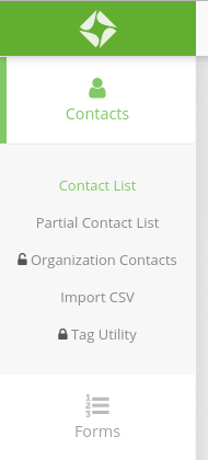
After
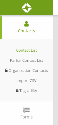
This update might seem small, but again, it’s all about accessibility. We chose this new shade of green primarily because of its increased readability, but we also think it’s a significant aesthetic improvement, as well. Additionally, when you hover over a menu option, a green line will appear under the text—it’s just an extra touch to make navigating the site as simple as possible!
Save Time, Track Leads, & Simplify Your Business with Dakno Admin
Here at Dakno, we don’t just settle for the way things are—we’re always looking for even the smallest ways to take our platform (and yours!) to the next level.
If you have any questions about navigating the newly designed Dakno Admin, feel free to get in touch with us. We’d love to hear what you think!
