In his retelling, one day in his youth, Donald went to the store and, using his hard-earned allowance money, bought chocolate, marshmallows and graham-crackers for his cousins. Each cousin would be gifted enough ingredients for one s’more. Gleefully he passed out the ingredients, heart swelling with the joy of giving, to his eagerly awaiting kin.
But his youngest cousin apparently failed to understand that this seemingly random assortment of ingredients would come together to make something so delicious that its very namesake derived from the desire for more of it. Upon receiving such a benevolent gift, this cousin took this generous bounty and crushed it in his grubby little fingers. Crumbs feel to the floor like dust as chocolate smeared his hands.
 Of course this cousin would rue his choices once the truth became revealed. The smushed marshmallow may have felt good as it billowed through his fingers. The graham-crackers may have made a satisfying crunch as they disintegrated in his palm.
But having failed to understand the true purpose of his gift, he was left to watch as his cousins enjoyed their succulent s’mores, weeping as he held the ruin of ingredients in mournful hands.
Art vs. Design, Me vs. You
“If you do not understand the purpose of a thing you will inevitably misuse it” — Dr. Myles Monroe
The truth is that there is a lot of misconception around the primary purpose of good design. Even among designers. A lot of beautiful websites end up as broken as the crushed ingredients in Donald’s cousin’s hands.
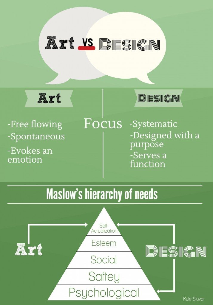
There is a thin line that separates art and design. But as thin as this line is, it demarcates a profound difference. The primary purpose of art is often introspective. How the artist expresses themselves. How the viewer feels and thinks about the piece within themselves. In this, the artists beliefs are paramount, superseding that of the audience. It’s about “Me”.
Design however is different. Good design is inextricably tied to its purpose. And its purpose is always about “You”. How will the audience perceive this work. How will they engage with it. What benefit does this design give them.
Good design must always keep the “you” in mind.
Who is “You”?
No, I did not suddenly forget the principles of English verb conjugation. If good design less about me and more about “you” then it follows that identifying who is the “you” in question is of the utmost importance. You may be tempted to think of the “me” as the designer, and you, the Realtor, as the “you”. And you would be wrong.
In the case of real estate web design, the “you” is always the site visitor. I wrote in a previous blog post about the importance of allowing the visitor quickly and easily find what they are looking for. So keep that in mind as you enter the design process.
What’s in It for Me?
Ironically, it’s when you’re focused on the end user, that you reap the most ROI. Remember, when you fail to understand the purpose of something it is inevitable that you will end up misusing it.
The inverse is also true. When you remember that the purpose of a real estate website is your end user then your design will perform much better. And a higher performing website means more leads for you. Which is the whole point of all of this.
When your real estate web design is end-user focused, you will have better calls-to-action, a more effective user-interface, and improve the overall user-experience. And when that happens, visitors are more likely to become inquirers by filling out forms for more information, creating accounts to save their favorite listings, and viewing you as their primary resource for their real estate needs.
You will indeed have a delicious s’more, instead of a handful of beautiful rubble.


